Why we’re updating our logo – and why our commitment to the neuropathy community remains strong
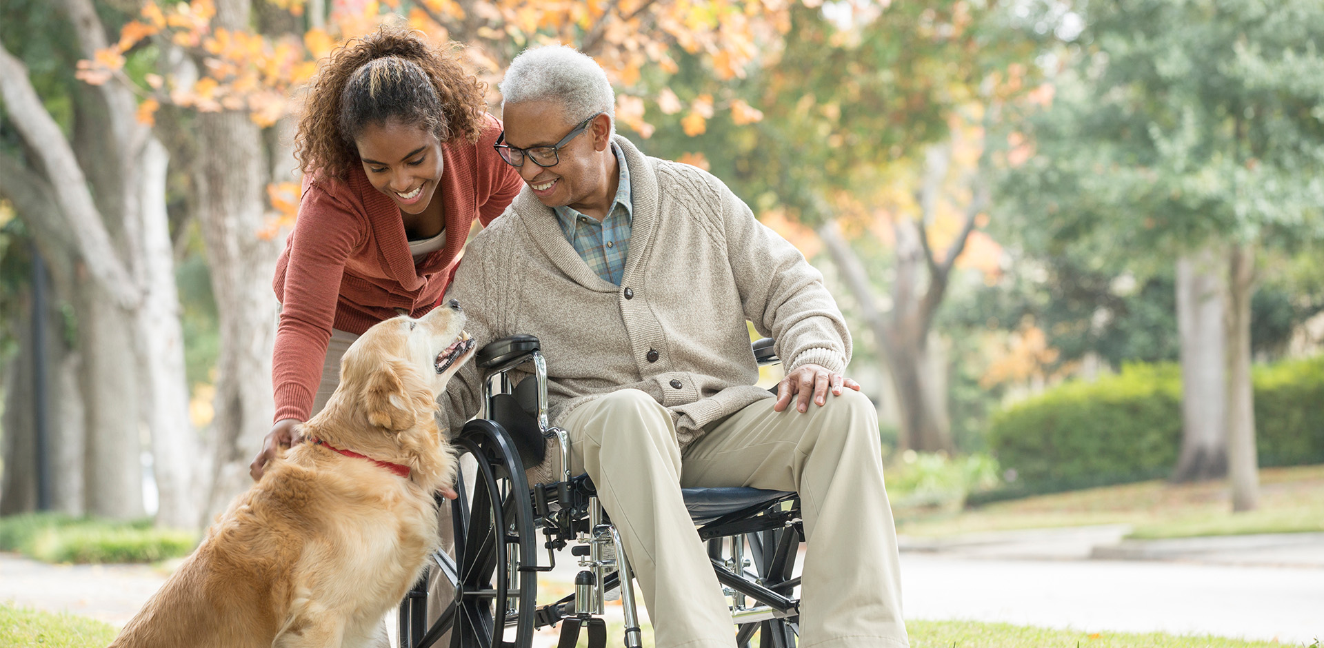
For nearly two decades, the Foundation for Peripheral Neuropathy (FPN) has been a trusted place for people living with peripheral neuropathy (PN). We provide information, support, and a sense of community. As our work has expanded, our audience has grown too. Because of this, it’s important that our visual identity shows who we are now and where we’re headed in the future.
That’s why we’re introducing a new logo. Our look may be changing, but our mission is not. We remain fully committed to improving the lives of people affected by PN through education, research, advocacy, and awareness.
Why we’re updating our logo
Earlier this year, we studied how people in our community felt about several logo options. We gathered feedback from people with neuropathy, caregivers, healthcare providers, researchers, and others. One design clearly stood out and was chosen as the favorite by more than 80% of respondents. People described it as:
Trustworthy
Caring
Modern
Clear
Distinctive
The feedback showed that our community wants a logo that feels warm, credible, and clearly connected to neurological health. Our new logo delivers on those values.
A logo that shows connection – and the reality of neuropathy
Living with residual peripheral neuropathy in my left foot and calf from a training injury years ago gave me a more personal lens on logo design and development. I understand firsthand the uncertainty and frustration that often accompany the condition.
As a resource hub, the Foundation for Peripheral Neuropathy’s logo needed to communicate connection, community, and optimism, and it would be a bonus to subtly allude to nerves in some way. This comes together to reinforce both the science and the humanity behind the work.
The chosen concept was designed to resonate emotionally while remaining adaptable and technically sound across all media applications.
We are happy with how the logo was received by our friends at FPN, and we’re looking forward to helping activate the updated brand.
At the center of our new logo is the neuropathy star icon. You may notice small breaks in the shape. These breaks are intentional. They represent damaged or disrupted nerves, which are a core part of what people with neuropathy experience.
But the icon isn’t only about the challenges of PN. It also represents coming together.
Its outward‑reaching lines show connection – patients finding support, caregivers finding information, and our whole community coming together to access trusted resources. This symbol reflects our purpose: connecting people to knowledge, research, and each other.
Modern and more versatile
You will also notice that we now use the color purple. This aligns our logo with the awareness color for peripheral neuropathy, so our logo now matches the broader PN awareness movement.
This makes it easy to use across digital platforms, printed materials, and awareness campaigns.
What has not changed
Even though our look is new, our purpose remains exactly the same. We are – and always will be – committed to:
Our new logo simply gives us a stronger and more welcoming way to communicate this work.
Looking ahead – together
We see this updated logo as a sign of hope, progress and unity. The breaks in the star remind us of the challenges our community faces. The bright, connected lines show the strength we share when we learn, advocate, and support one another.
As we move forward, we’re grateful for the feedback that shaped this direction – and even more grateful for the people who guide our mission every day.
A new look. The same strong commitment. And a future we’ll build together.